

Mobile app analytics can become noisy fast. Downloads, sessions, revenue, ratings, crashes, campaign data, and survey results all compete for attention. The useful approach is to track a small set of metrics that answer three questions: are people using the app, are they staying, and is the business model working?
The ten metrics below give product, engineering, and growth teams a shared view of app health. They are most valuable when you combine quantitative dashboards with qualitative context from in-app surveys, bug reports, and feature requests.
1. Daily and monthly active users
Daily active users (DAU) and monthly active users (MAU) measure how many people actually use your app in a given day or month. This is more useful than downloads because it filters out people who installed the app once and never returned.
Define "active" carefully. For a social app, active might mean posting or messaging. For a SaaS mobile app, it might mean completing a workflow, checking a dashboard, or replying to a customer. A loose definition can make the metric look healthy while real product usage is weak.

2. Stickiness
Stickiness shows how often monthly users come back on a typical day. A common calculation is DAU divided by MAU. If your app has 10,000 monthly active users and 2,000 daily active users, stickiness is 20%.
Use this metric to compare releases, onboarding changes, and habit-forming features. If stickiness rises after you launch push notifications or a new in-app workflow, that is a useful signal. If it falls, look for friction, reliability issues, or unclear value.

3. Retention rate
Retention rate measures how many users come back after a first session, signup, purchase, or other key event. Track it by cohort rather than only as a blended average. A cohort view shows whether users who joined after a specific release behave differently from older users.
For SaaS teams, retention is often the clearest sign that the mobile app supports the larger customer journey. If account admins keep returning but invited teammates disappear, the problem may be onboarding. If new users leave after a crash-prone feature, the problem may be quality.

4. Churn
Churn is the inverse of retention: it shows the share of users or customers who stop using the app during a period. For consumer apps, churn may mean inactivity. For paid SaaS products, it often connects to subscription cancellations, downgrades, or seats removed from an account.
High churn rarely has one cause. Segment it by platform, plan, acquisition channel, version, and user role. Then use feedback tools and support conversations to understand whether people are leaving because of missing features, poor performance, bugs, pricing, or unclear onboarding.

5. Average session length
Average session length shows how much time people spend in the app during each visit. Longer sessions can mean strong engagement, but context matters. A long session in a meditation app may be good. A long session in a bug reporting flow may mean the task is too hard.
Look at session length together with completed actions. If time in app increases while task completion falls, the app may be creating friction instead of value.

6. Average revenue per user
Average revenue per user (ARPU) tells you how much revenue the average user generates in a defined period. For mobile SaaS, this can include subscriptions, seat expansion, in-app purchases, or add-ons.
ARPU becomes more useful when segmented. Compare free users, trial users, paid plans, regions, and acquisition channels. A channel with lower signup volume but higher ARPU may be more valuable than a channel that drives many low-fit users.

7. Cost per acquisition
Cost per acquisition (CPA) shows how much you spend to acquire one user or customer. Calculate it by dividing campaign spend by the number of acquired users for that campaign.
Do not evaluate CPA in isolation. Cheap users who churn quickly can be more expensive than high-intent users who cost more to acquire but stay longer. Connect CPA to retention and lifetime value before scaling a channel.

8. Lifetime value
Lifetime value (LTV) estimates how much revenue a user or customer generates over the full relationship with your app. For a subscription product, it often depends on average revenue, gross margin, expansion, and churn.
LTV is especially important for roadmap tradeoffs. If users on high-value plans repeatedly request the same workflow, a public roadmap and feature voting process can help the team prioritize improvements with visible customer demand.

9. Return on investment
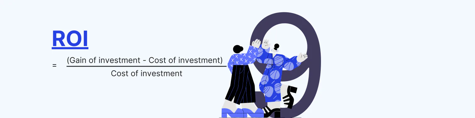
Return on investment (ROI) compares the gain from an investment with the cost of that investment. For mobile apps, you can calculate ROI for acquisition campaigns, onboarding work, performance improvements, or support automation.
To calculate a simple campaign ROI, subtract the cost of the campaign from the revenue it generated, then divide the result by the campaign cost. Google also provides a useful guide to ROI in Google Ads.
10. App store rating
Your app store rating is a public quality signal. It affects trust before a user ever opens the app, and it often reflects problems that internal dashboards miss: crashes after an update, confusing flows, missing localization, or support delays.
Do not wait for negative reviews to discover quality issues. Give users an in-app way to report bugs with screenshots, logs, and device context, then close the loop when the issue is fixed. That turns app quality from a public surprise into a managed workflow.
How to make mobile app metrics actionable
A metric should lead to a decision. Before adding another dashboard tile, define the owner, review cadence, and likely action for each metric. For example, retention belongs to product and customer success, crash-related rating drops belong to engineering, and CPA/LTV belongs to growth and finance.
The best teams combine analytics with customer context. Numbers tell you where to look; feedback, bug reports, and support conversations tell you what to fix.